Type
Branding,
Diseño UX,
Diseño UI
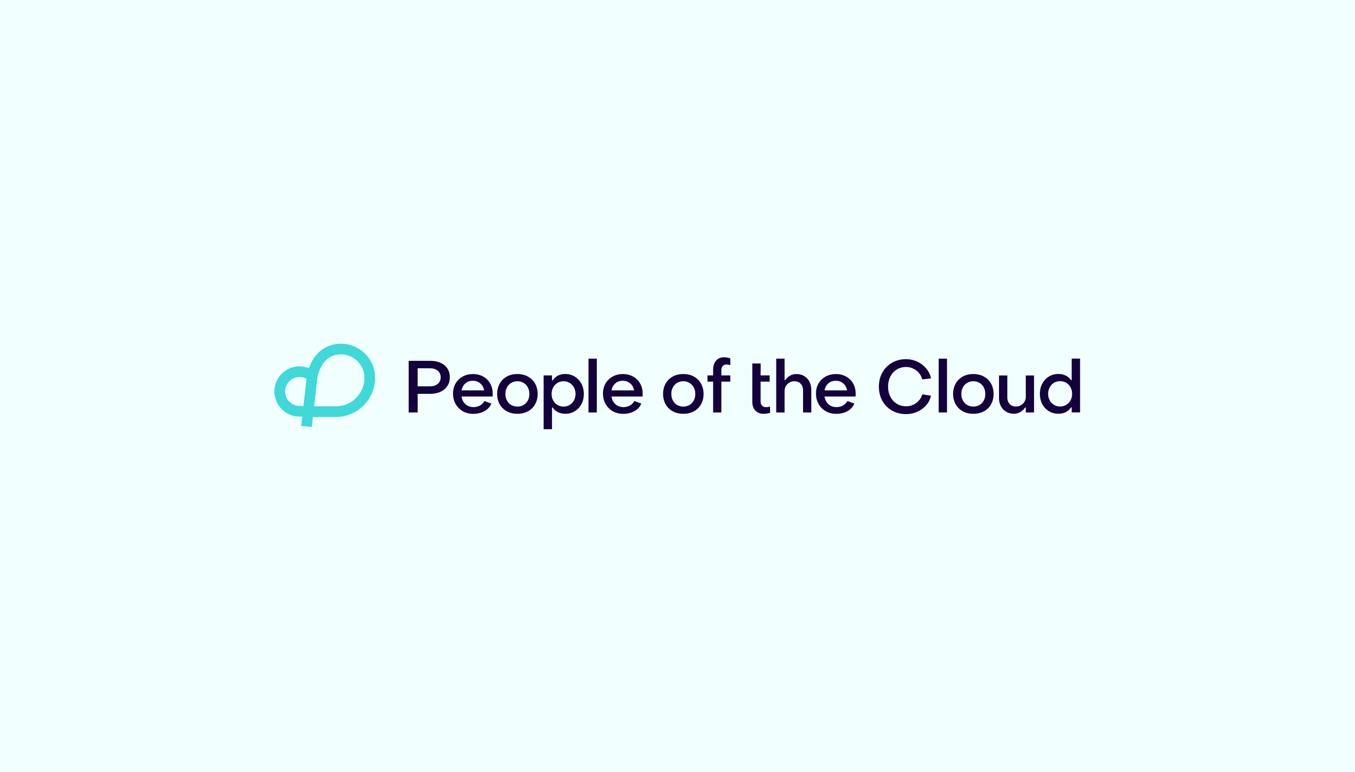
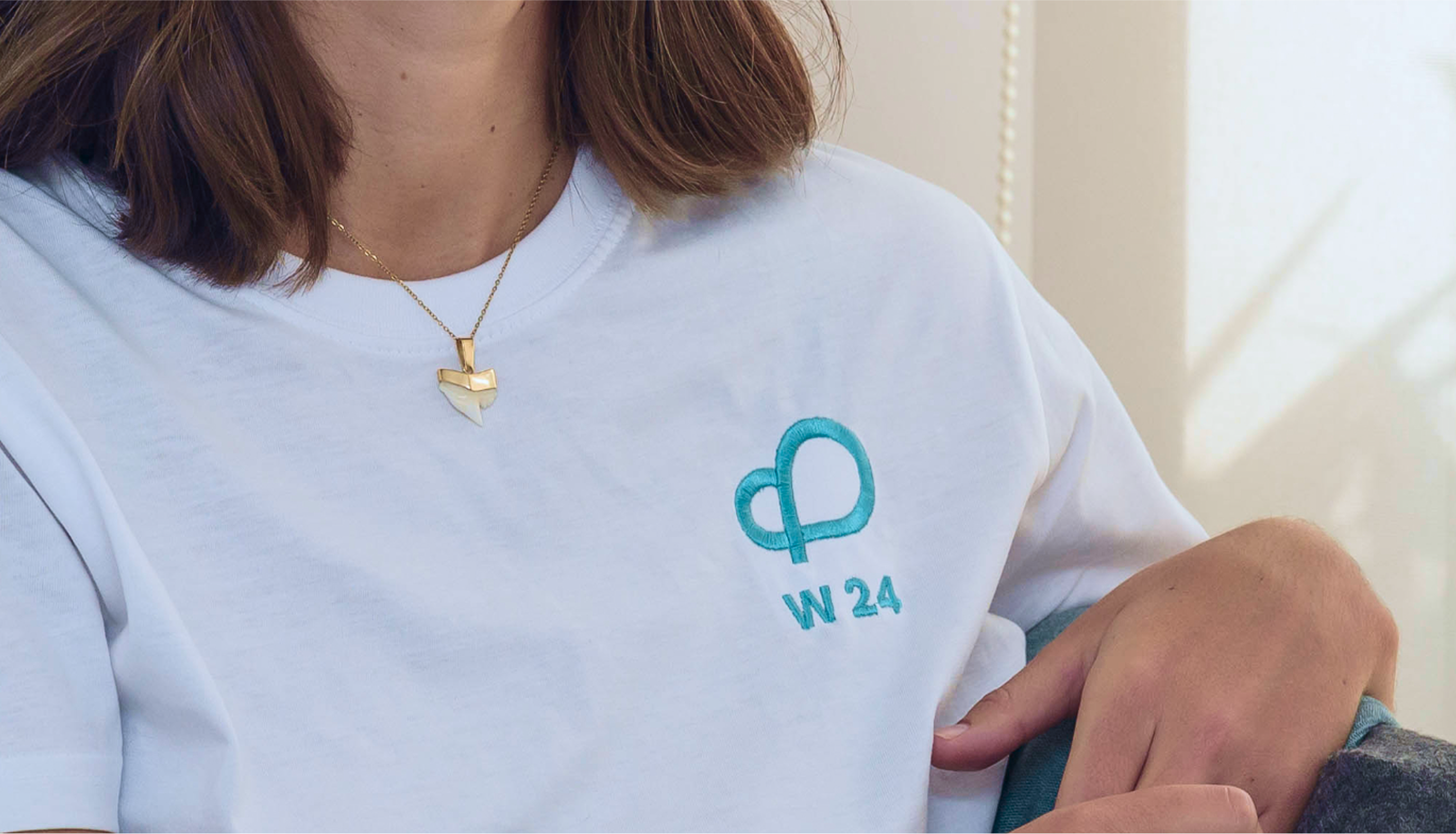
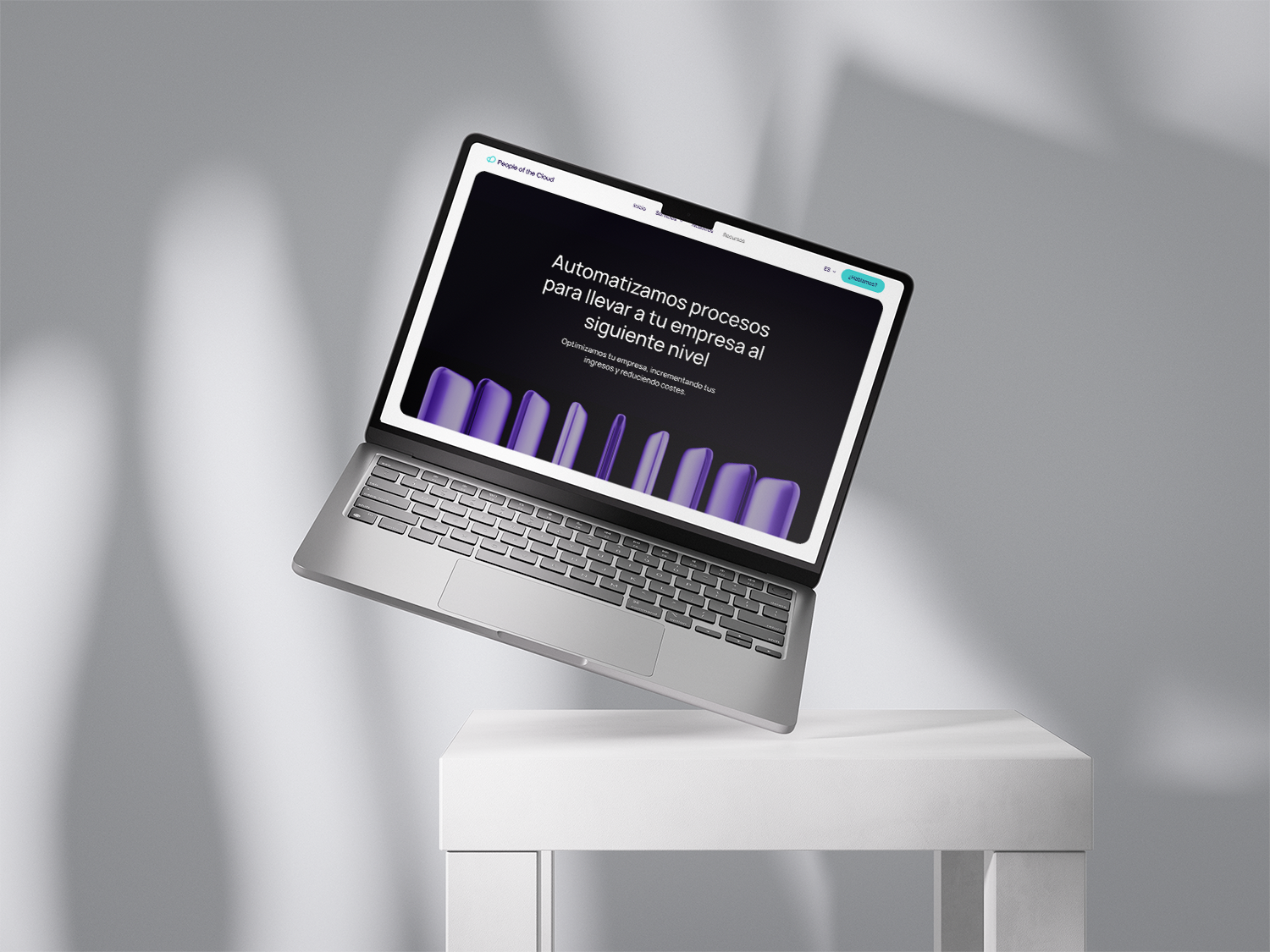
The redesign of the logo is based on a symbol created from the letter “P” for people, which, when traced, forms a “C” for cloud. Together, they form a cloud shape. In addition, the continuity of the isotype alludes to process automation.


La IA no es tu enemigo.